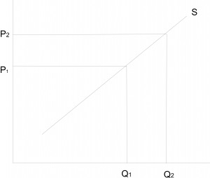
The graph above represents _______
...
The graph above represents _______
A decrease in quantity supplied
An increase in supply
A decrease in supply
An increase in quantity supplied
Correct answer is D
There is an increase in the quantity supplied if the quantity supplied increases as a result of an
increase in price of the commodity.
From the graph, an increase in the price of the commodity from p1 to p2 brought about a
corresponding increase in quantity supplied from q1 to q2.
Similar Questions
When price is set below equilibrium, this will lead to ...
Post harvest losses in West African countries can be reduced if ...
Which of the following is necessary for the survival of small firms in West Africa? ...
When a nation is experiencing balance of payment surplus, it is in a better position to ...
The law of demand can be expressed as ...
Which of the following is a luxury item? ...
The demand curve facing the monopolist in the foreign market is_________ ...
Changes in the value of money can be measured by ...
The active population of a country determines the size of its ...